New feature for Lime - an electric bike renting mobile app
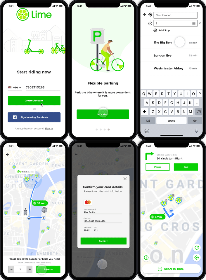
In a two-week sprint, I worked in a team of four to integrate a new feature for the existing Lime bike mobile application creating a hi-fi clickable prototype. The new feature is added to help customers creating a multi-point sightseeing tour, browse sight details for major attractions, secure rental bikes nearby and a more personalised app experience as a way to retain current customers and attract potential users.
Role
UX Researcher/UI Designer (Group Project)
Duration
2 weeks
UX Techniques
User Research | Competitive Analysis | Sketching | Sitemaps | User Flows | User Testing| Wireframing | Prototyping
Tools
Sketch | inVision | Photoshop | Pen and Paper
The brief
Lime Bikes is an electric bike service that users find and unlock on the mobile app that knows the location of available vehicles via GPS. In November 2018 Lime moved to London and now has a fleet of over 1,000 electric bikes. Lime is founded on a simple idea that all communities deserve access to smart and affordable mobility.
You locate the nearest Lime bike through their smartphone app, scan a QR code on the rear mudguard, and the bike should unlock for you. Test the brakes, and you’re ready to ride. The rental costs an initial £1 to unlock the bike, plus 15p for each minute it’s in your possession. The system allows users to use mobile app to unlock dockless vehicles and park them on the streets when trips are completed – but they must avoid the red zones or they will need to pay a £10 fine.
Our client shared four main points they would like us to take in consideration:
- Onboarding for new users
- A new annual membership option
- Ability to choose or create a multi-point sightseeing tour
- Ability to view/browse sight details for major attractions (e.g. opening hours, prices, description, map, etc.)
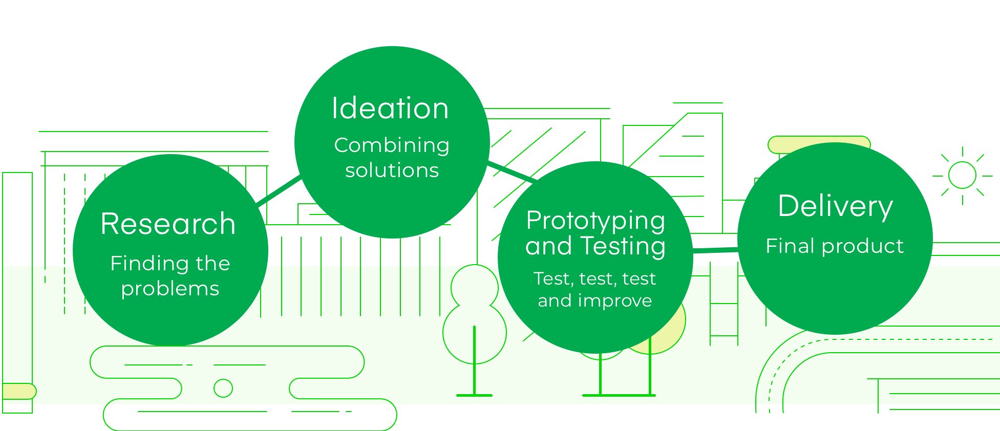
Research
Competitive Analysis
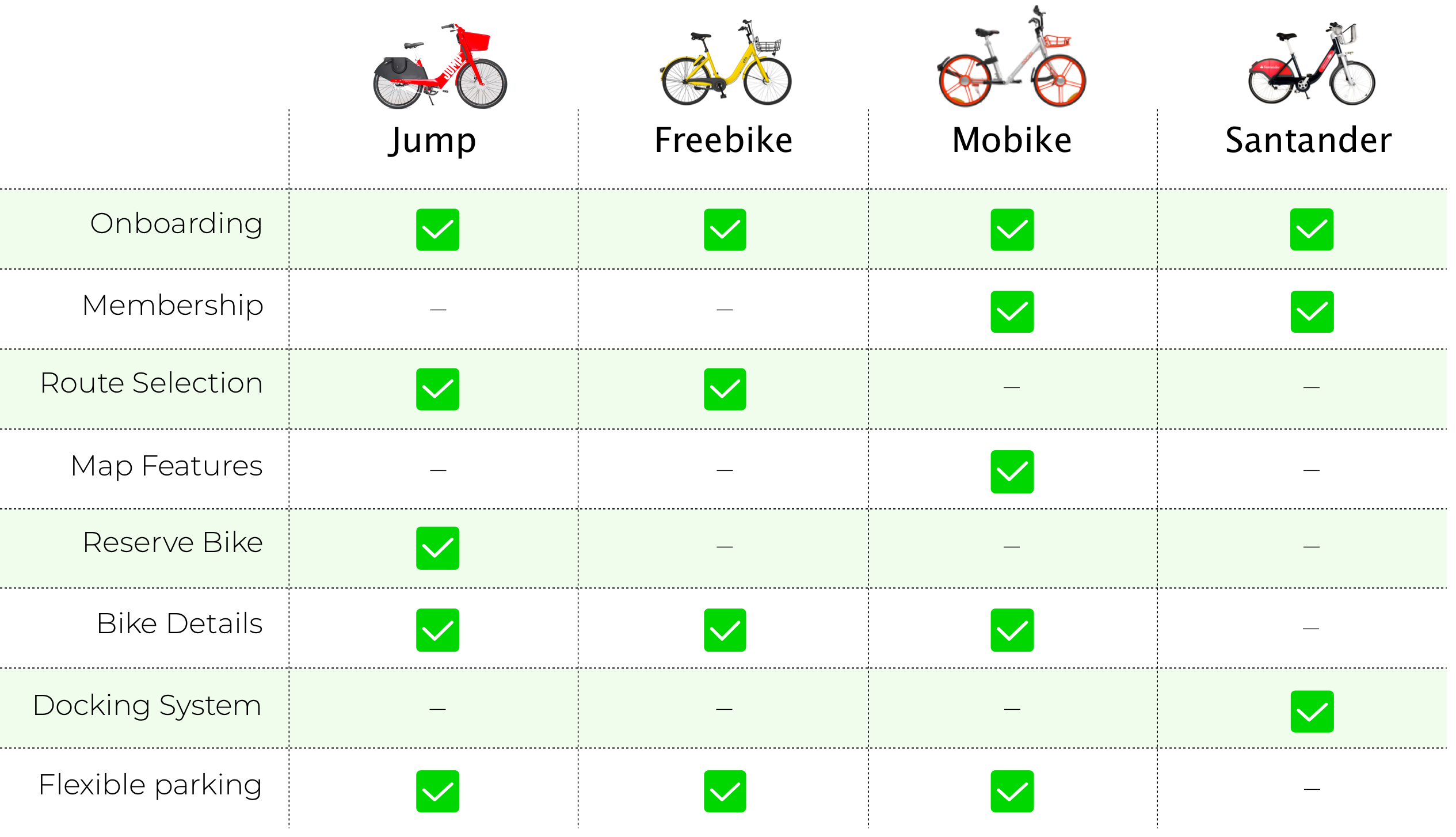
To understand the transport market a bit further, we conducted a competitive analysis of direct and indirect competitors of Lime. We also compared some important features from traveling apps as we would like to optimise the experience of users when it comes to planning holidays and bike tours.
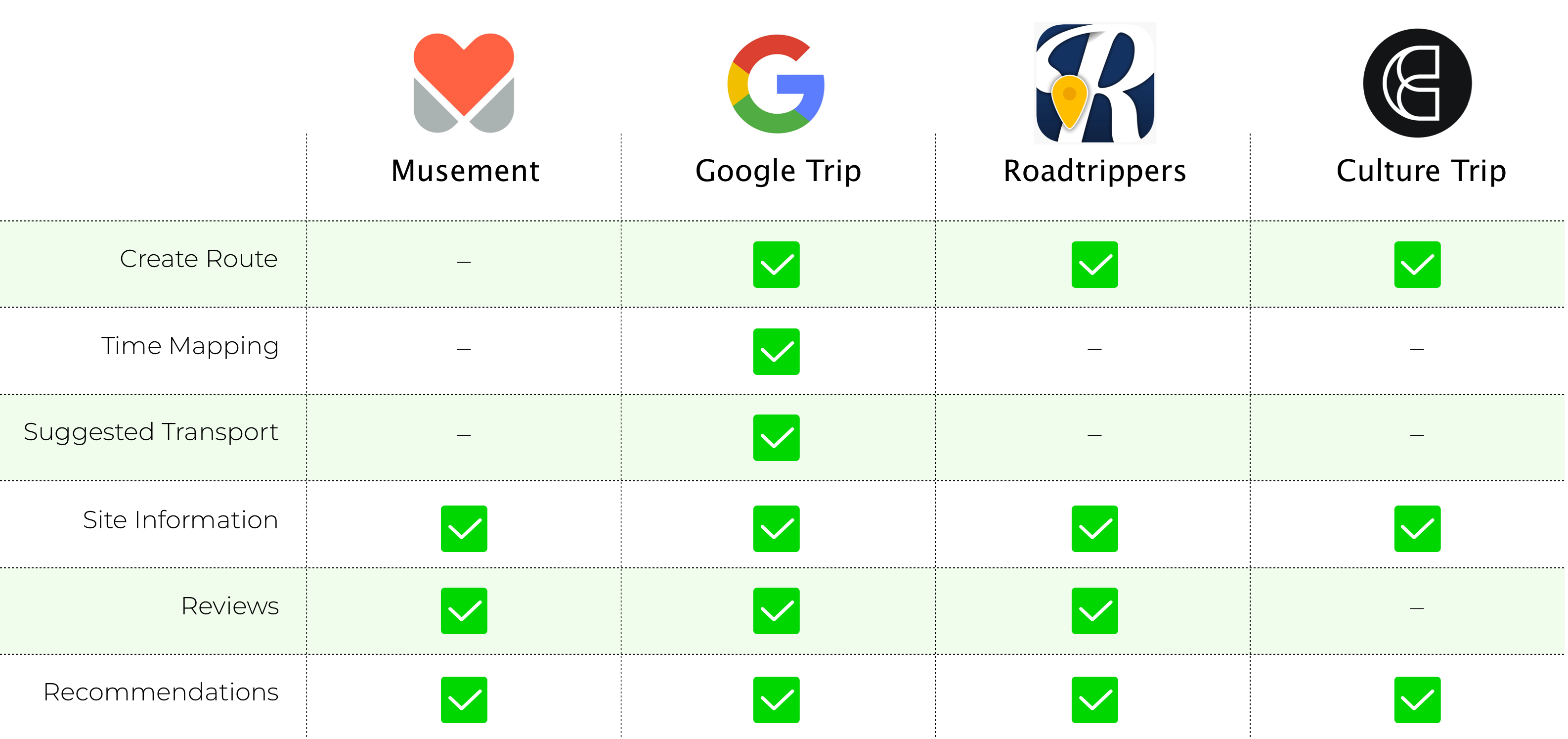
Findings:
- When it comes to Map Features and Reserving the bikes, only two direct competitors were offering those services to clients. I will explore both of them later on and explain why we decided to focus on them to develop the new feature. Santander also has an advantage as the only rental bike service with docking stations – which makes it easier for you to rent more than one bike at a time.
- Google Trip was the only indirect competitor that offered all the services we selected from our original brief so we decided to use it as an inspiration of how we could solve our main problems.
On Site Visit
To understand the experience of hiring a Lime bike, we conducted a site visit and made some interviews to localise the pain points for users.
Findings:
- People were on a rush and couldn’t stop to talk to us – a reason why most of them were hiring Lime Bikes.
- Some users felt frustrated because the nearest bikes were not charged.
- The cycle hire scheme was very confusing to some users as they were missing an initial onboarding process.
- Users were not able to calculate routes on the current app so they had to keep another app open (e.g. Google Maps).
- Some of the available bikes showing on the app were actually on some people’s gardens.
- The hiring price was confusing as they were not sure how long it would take or how much they would spend more or less before paying to unlock the bike.
“When I’m cycling, I always need to keep at least two apps open: Lime and Google Maps. It’s hard to cycle when you need to check the route somewhere else if you are unfamiliar with the location you are going to.”
Quantitative Survey
We sent out a short survey online asking people about their travel and commute behaviours in London and if they were used to hiring bikes for themselves. Through this method, we were able to filter and recruit research participants to conduct more in-depth interviews further on.
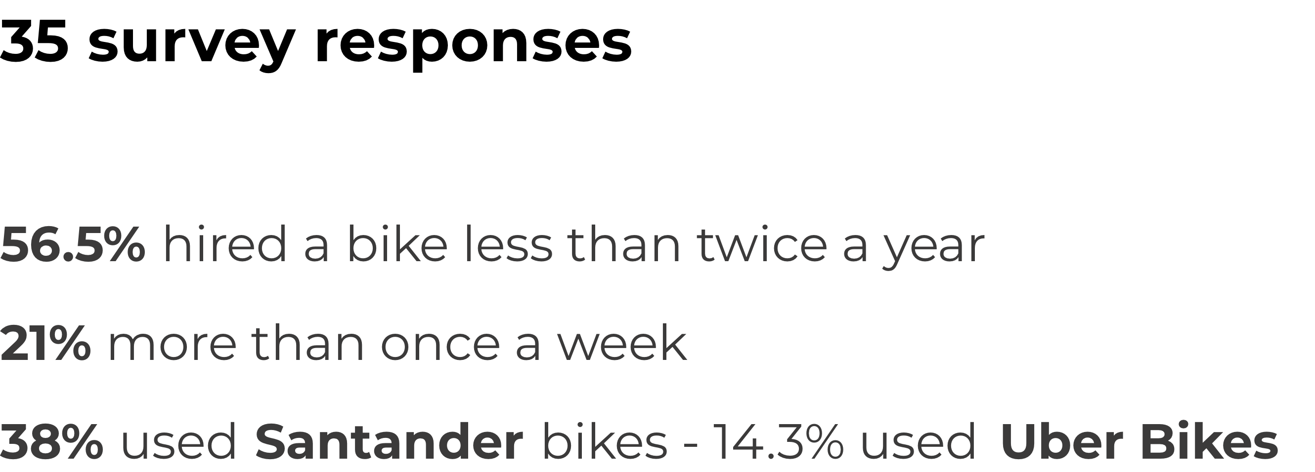
35 people responded in total but only 9 matched our criteria to move forward with personal user interviews. We tried to recruit two groups of interviewees; we wanted to talk to frequent and non-frequent cyclists to understand why and how they started cycling so that we could address their issues in our product.
User interviews/Qualitative Survey
During the interviews, we asked individuals about their travel and commute behaviours in more depth. We wanted to understand how they travelled and the reason behind their behaviour. Further to this, they were also specifically asked about their attitude and feelings towards cycling in London or when on holidays.
Discover Trends and Identify Problems
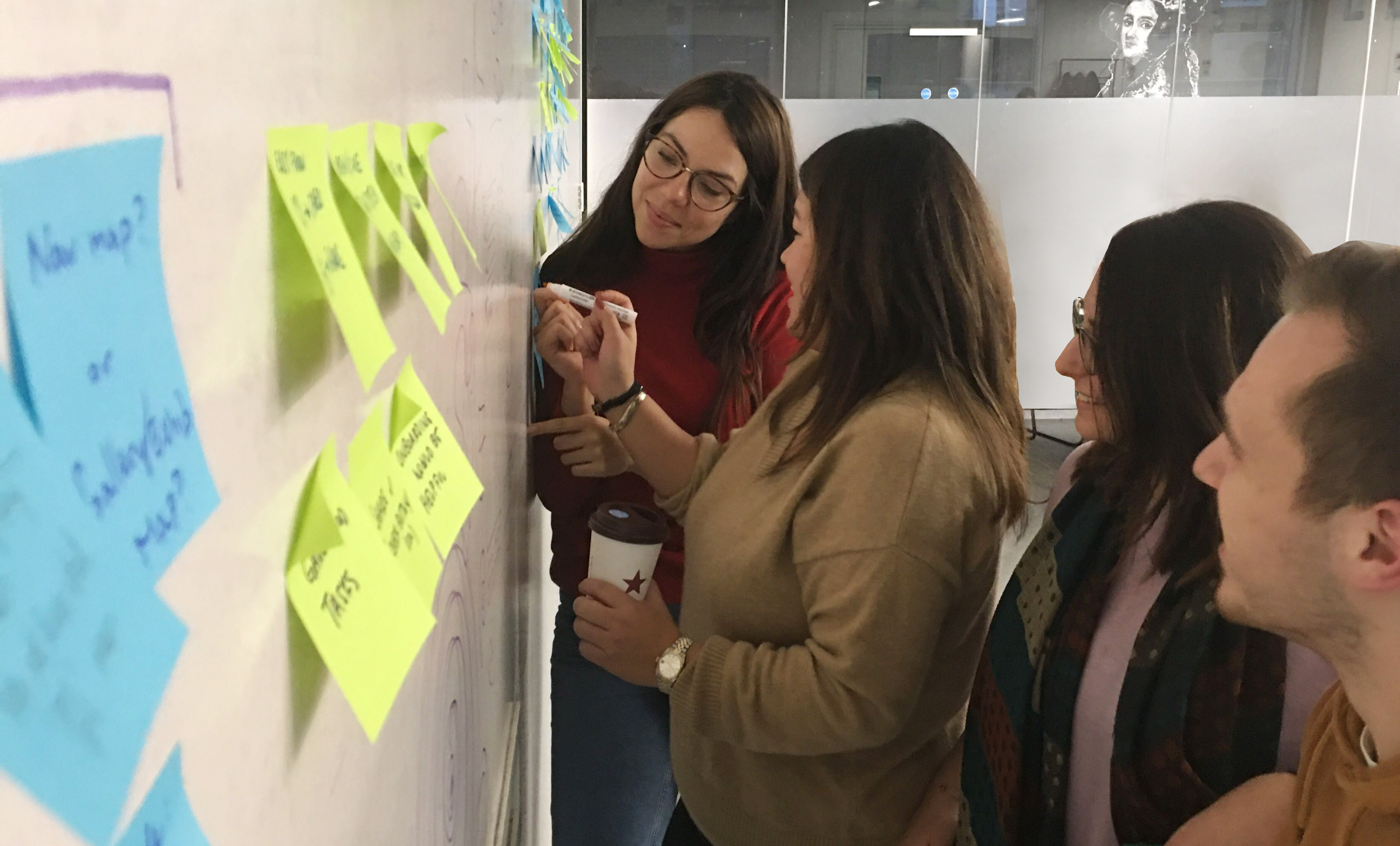
An Affinity Map was generated with a large amount of data and quotes from the user interviews and online reviews, a few common trends and pain points were identified. After the problem statement was formed, we were able to focus on finding solutions and opportunity areas that guided our project.
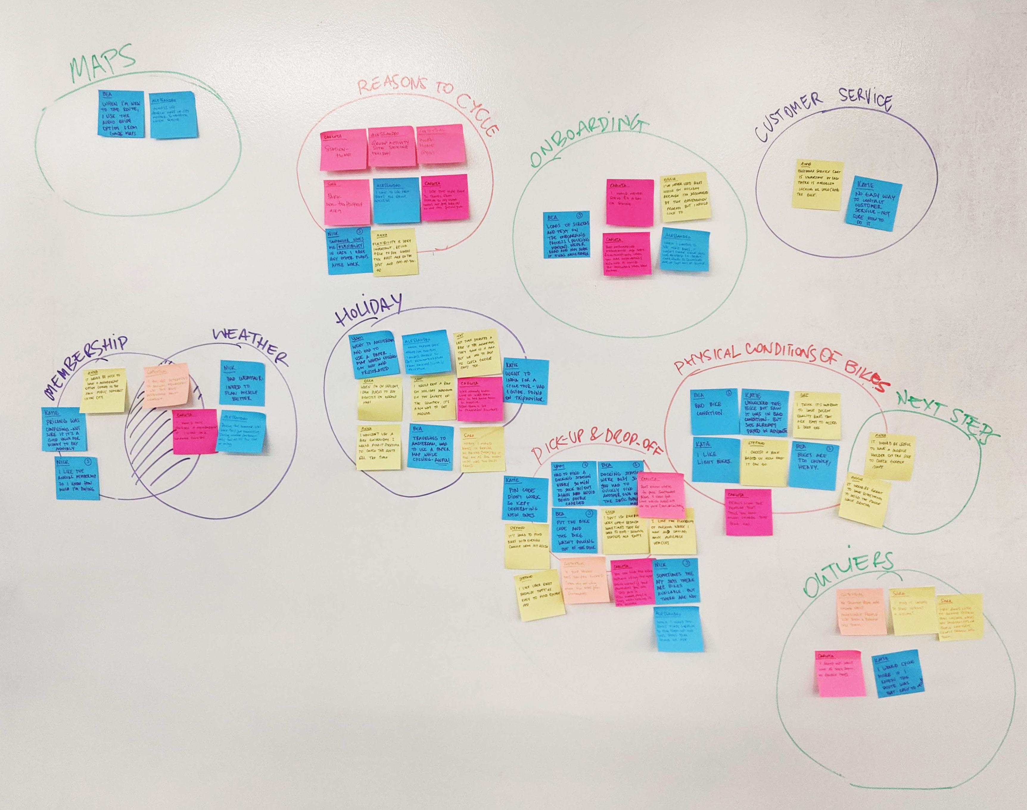
From those insights, we realised we would need to focus on some problems we could solve on the app. Many of the user’s feedback were about the quality and physical conditions of the bikes or how they were feeling unsafe knowing they would need to cycle without a helmet – considering it’s something you don’t necessarily have when hiring a bike ocasionally. They were also very vocal about issues they’ve had when it comes to pick-up and drop-off (e.g. mentioning the red zones – places they are not allowed to park and can be charged a fee if they do).
Findings:
- People need an easy way to check the route when cycling in an unfamiliar environment.
- Those who do not hire bike on holiday are discouraged by set up process.
- People are less likely to cycle during winter conditions.
Experience Map
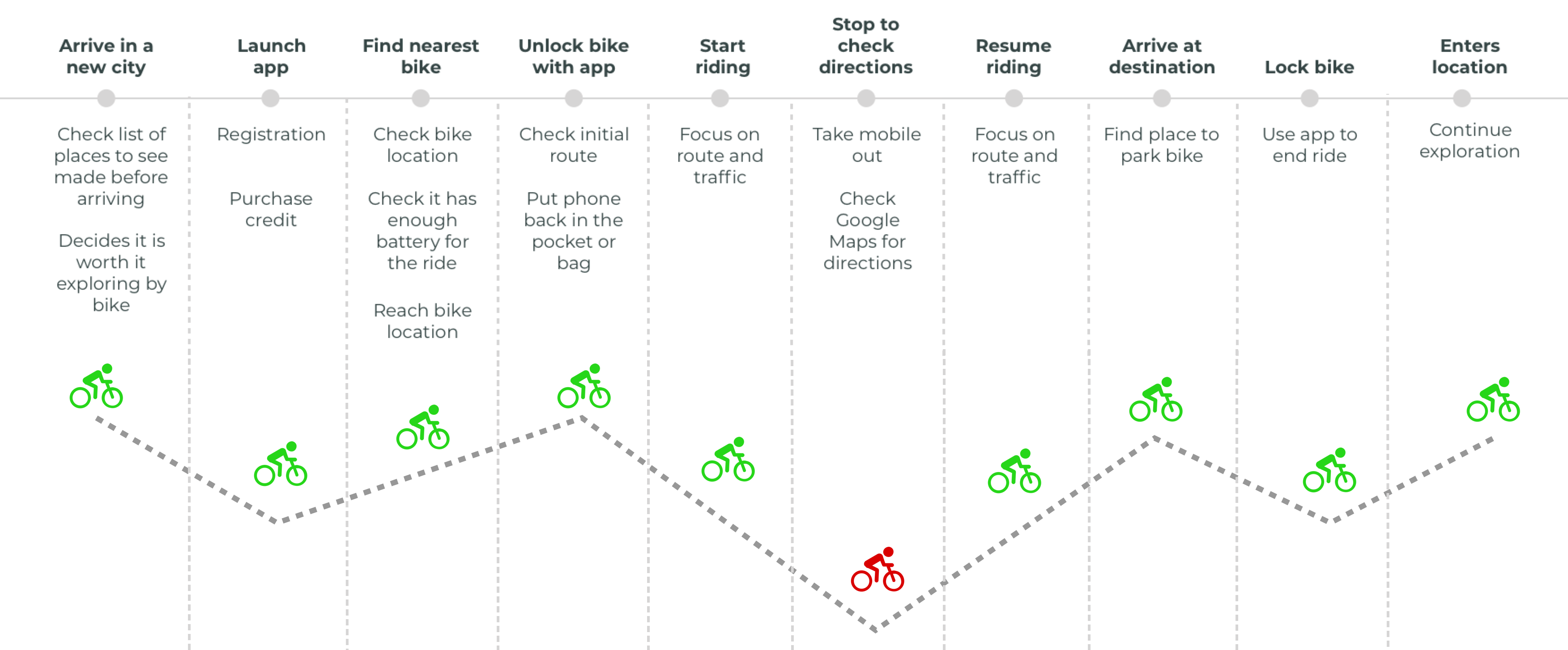
To understand a bit more about our user’s pain points when hiring a bike through a mobile app, we created an Experience Map.
Findings
It was clear that stopping to check directions was the main opportunity for us to stand out as a product. When cycling, users need to stop every once in a while to check the suggested route and see if they are following the right path. That’s not only dangerous but it also takes time to juggle between apps. If you look back to check the other competitors, they were not offering any alternatives when it comes to solving this problem either.
Persona
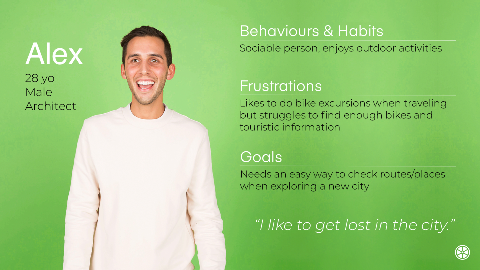
The insights synthesised from the user interview data has shaped our persona for Lime bike, Alex.
Problem Statement
An integral part of the design thinking process is the definition of a meaningful and actionable problem statement, which the design thinker will focus on solving.
"Alex needs an easy way to organise itineraries by bike to discover the city because he currently struggles to find all the information in one place."
Happy Path
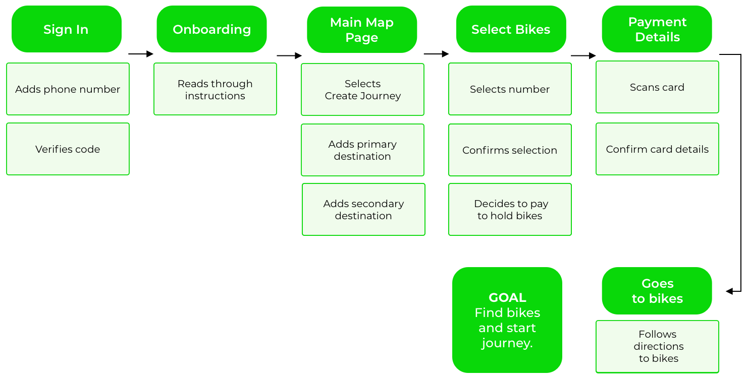
After defining our persona and understanding his problem, we created the happy path: the default user journey that a customer would experience if they proceeded to convert without any deviation during the process.
App Map
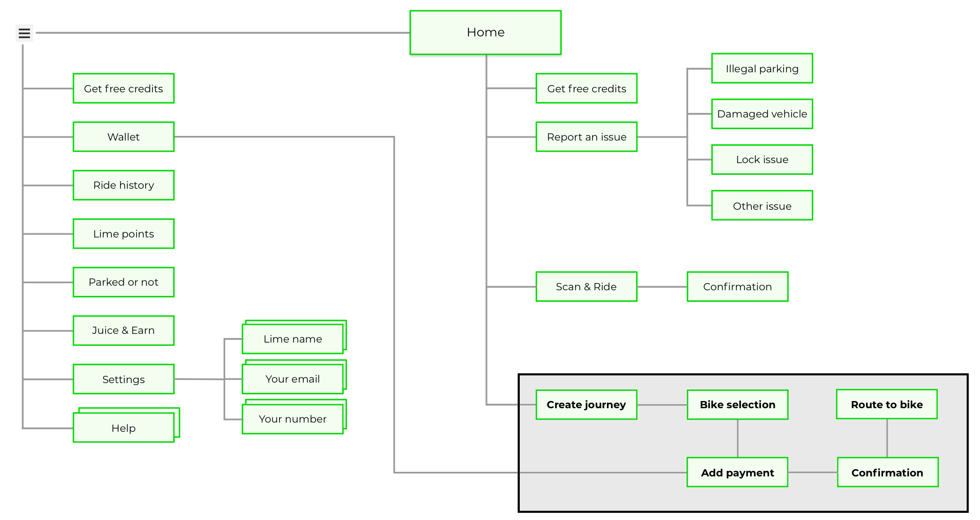
We also created the app map indicating where they would be placed – according to user’s feedback.
(The area highlighted in black (left) indicates the new feature we designed for the app – and where it would sit according to the current app map.)
Ideation, Prototyping and Testing
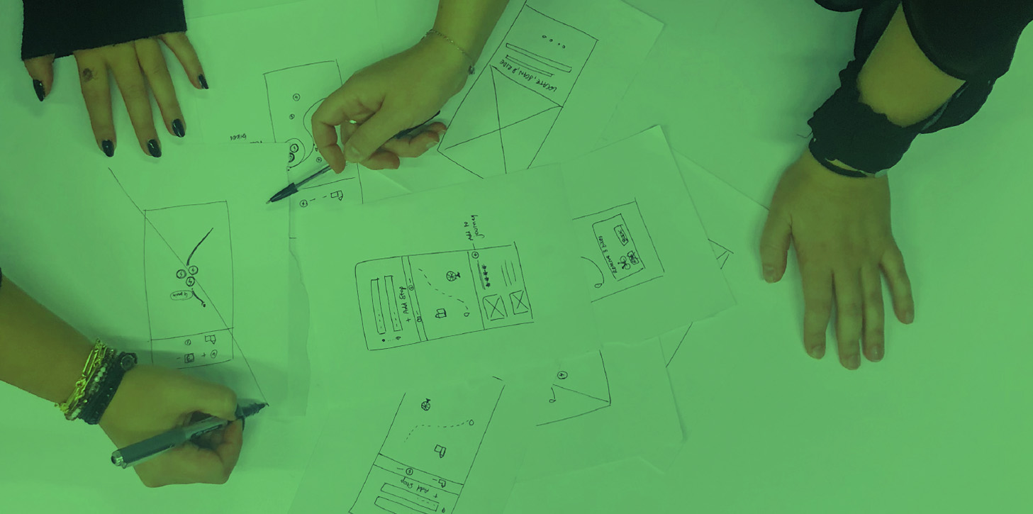
With the problem statement and our persona in mind, our team brainstormed for various potential solutions. Due to the balance of time and resources, create route, reserve bikes and add multiple stops were the priorities of the new feature integration. We started sketching and creating wireframes for our low-fi prototype.
Key point: We knew how important it was to test the low-fi prototype straight away as we wanted to collect some feedback from users and see if we were moving on the right direction.
Feature Prioritisation
With the problem statement and our persona in mind, our team brainstormed for various potential solutions. Due to the balance of time and resources, we decided to do a feature prioritisation matrix, that has an impact axis and an effort axis. We plotted all of the ideas that were produce from the second design studio.
As a group, we placed the features on this matrix, and decided to use the features that were high impact for the MVP. These are shown in the top two quadrants (in green). These included:
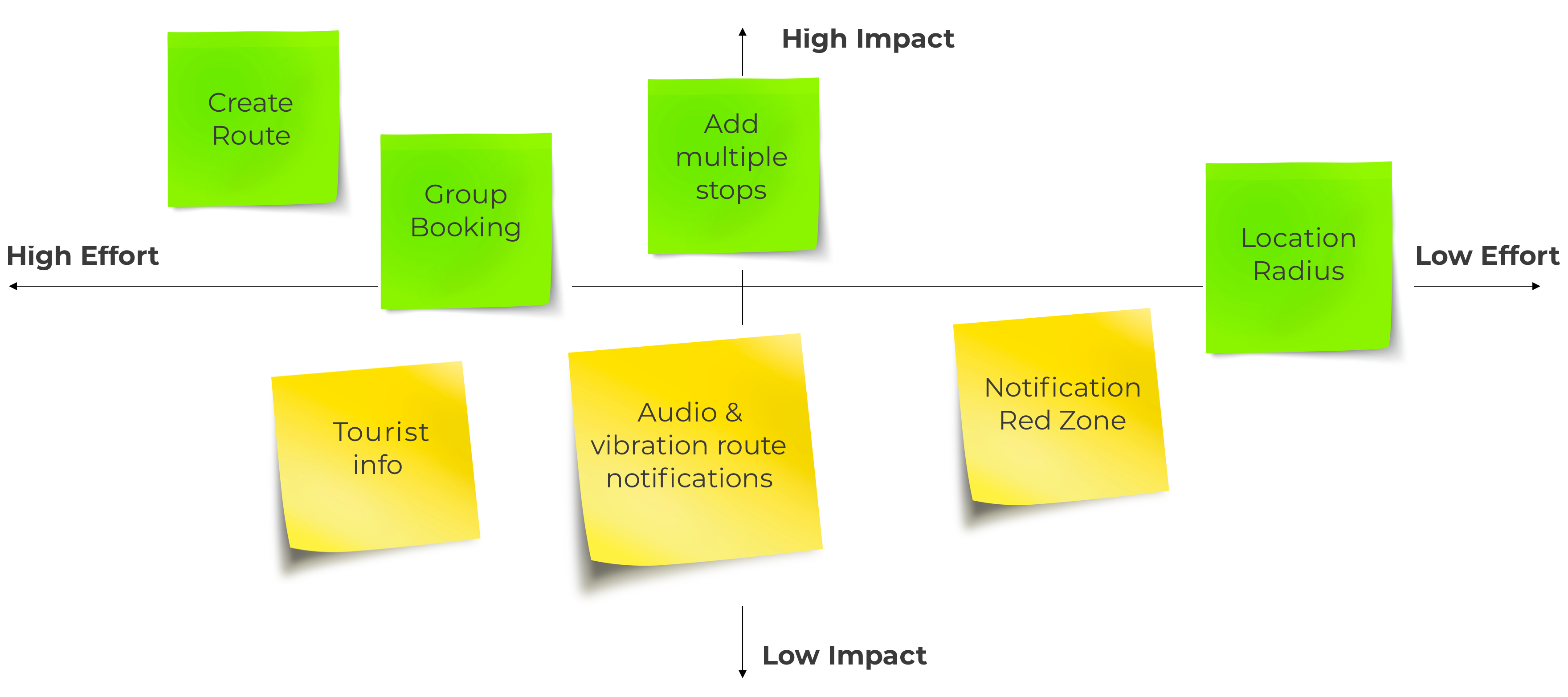
- Create route: Provide a map with the option of creating a route with the full route so users can focus on their journey while cycling to reach their goal destination.
- Group booking: Book more than one bike in just one process.
- Add multiple points: To ensure users don’t need to create a new route every time they want to go to a new place, they will be able to add multiple stops during their journey.
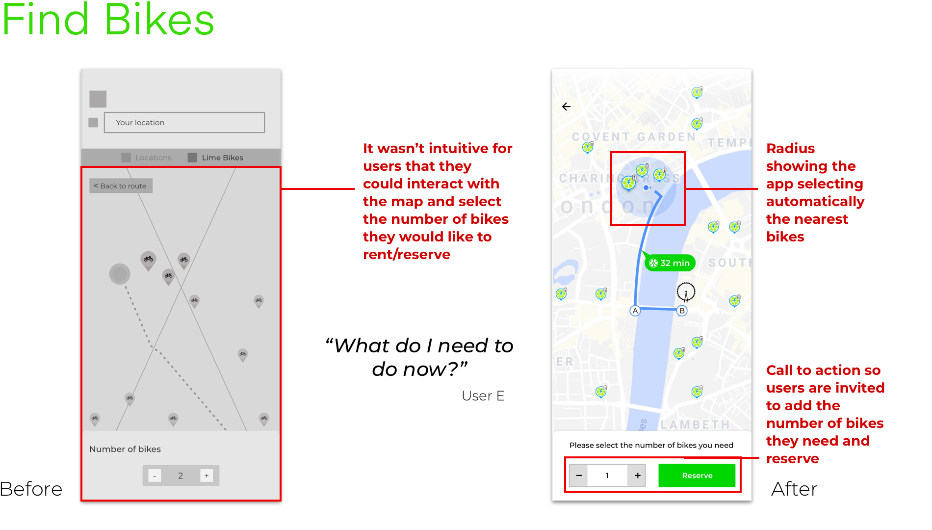
- Location Radius: The app will automatically select the nearest bikes considering the user’s current location.
HMW?
How-Might-We questions are a way to frame your ideation, and often used for launching brainstorms. This worksheet gives some strategies to use your current perspective on the challenge to create different How-Might-We questions that may prompt an array of fruitful ideas. The goal is to create questions that provoke meaningful and relevant ideas; do so by keeping the questions insightful and nuanced.
Suggests that a solution is possible and because they offer you the chance to answer them in a variety of ways. A properly framed How Might We doesn't suggest a particular solution, but gives you the perfect frame for innovative thinking.
How might we…?
… help people navigate a new city in an efficient way?
… help people create a bike group activity whilst travelling?
Usability Testing and Iterations
Lo-fi clickable prototype was tested. The scenario given to users was the following:
“Imagine two friends are coming to visit you in London. You want to show them the city by bike, as it’s a fun way to get around. You know that Lime has a new feature that allows you to plan your itinerary and hire multiple bikes.”
Tasks
They had to complete 3 main tasks:
- Set up the app.
- Plan a multi-point journey.
- Book three bikes.
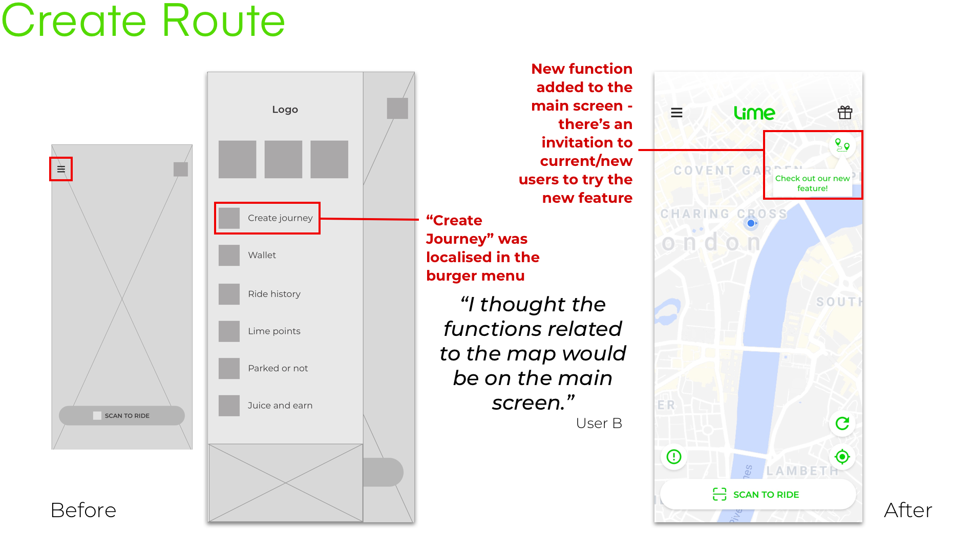
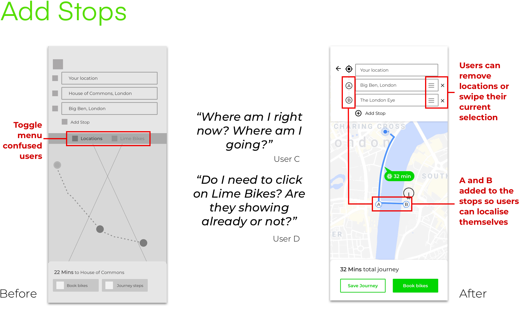
With all the instructions given to users, a few common problems were pointed out and addressed in the second iteration – and refined further on the final iteration. The main problems were:
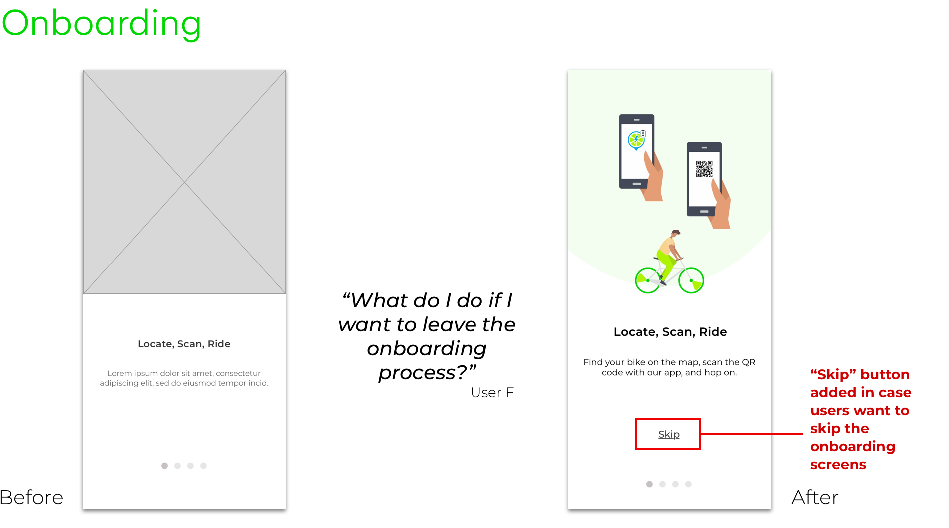
- Users would like to have the option to skip the onboarding process if they wanted.
- "Create Journey" was expected to be on the main screen, not on the burger menu.
- Users were confused about adding stops to their journey.
- Map interaction wasn't intuitive to users.
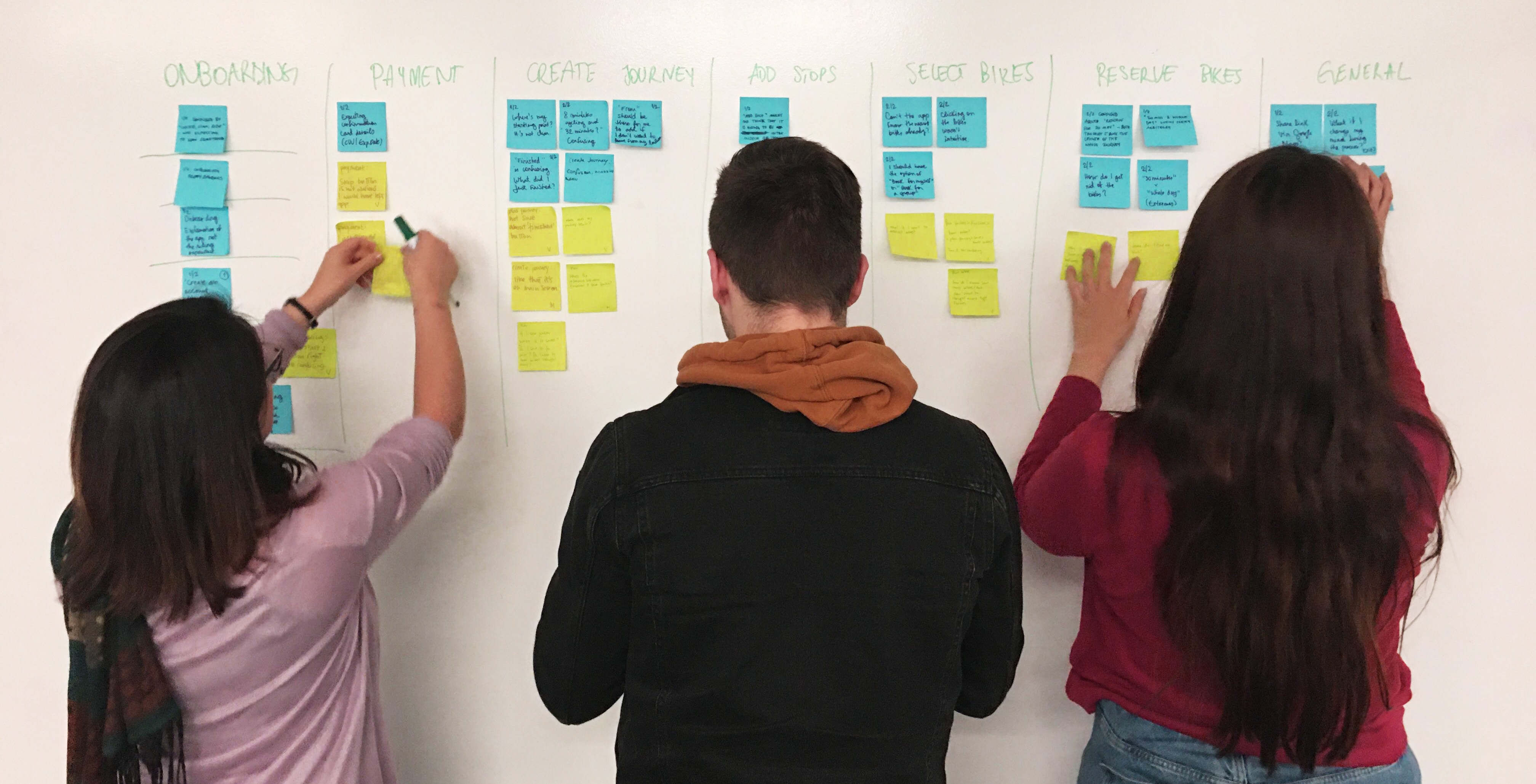
To better understand all feedback we received from V1, we’ve done an Affinity Map with the main issues and used post-its to find patterns on the possible changes we would need to do. That was very helpful when you have a lot of feedback and you want to put them together to have a visual and better understanding of your next steps.
Visual Guideline
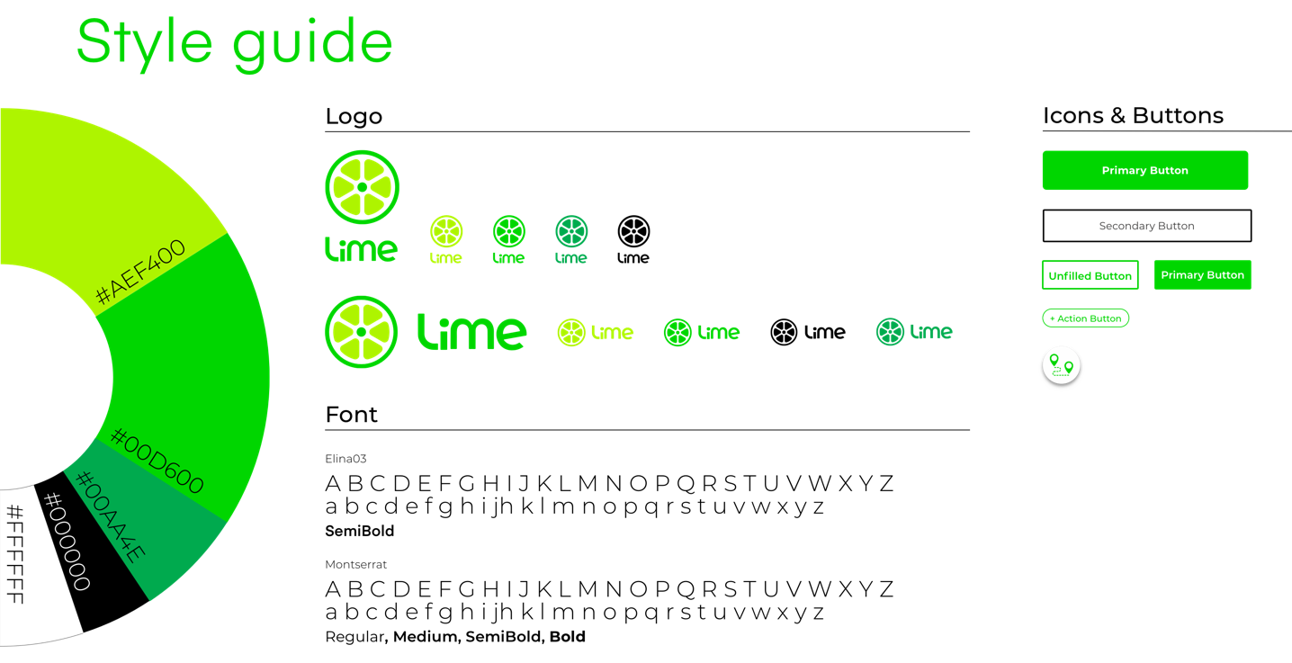
In order to apply the new features following the current branding of our client, we created a design guide with the visual elements of Lime. The look and feel of the app follows the original designs and we added some illustrations and a few other additional icons to help users navigate in the app.
Final Prototype
Next Steps
To continue to grow Lime, a few new features are considered to be added. They focus on improving customer service and giving users a more personal experience.
- Explore the membership options. Considering users are less likely to cycle during winter due to weather conditions, maybe offering discounts during specific seasons.
- Add the audio directions for users who have hearing loss or cyclists who want to hear the route while riding their bikes (using only one side of their earphones so they can still pay attention to the traffic).
- Messaging feature will be considered to connect other Lime users. This is beneficial for the users to be able to navigate when collecting bikes for a large group of people so they communicate between each other as well.
- Developing the social media aspect of the app will help the business raise brand awareness and continue to grow Lime culture as a brand to attract new users.
- Instant chat and customer service within the app will also help Lime users to access instant help and information.
- More flows and more testing to keep improving our product.
What I’ve learnt...
Great team work makes the dream work
I truly enjoyed the project and appreciate my supportive teammates who were very committed to the excellence we wanted to achieve. We were able to brainstorm and express our creative ideas and I felt we were all deeply involved in the project. In the end, we combined all of our great ideas to the final solutions based only in the research we’ve intensively done. Timeline and file-management were also very important to the project due to the short project time frame. The cross-functional team helped each of the members strictly follow the deadline and deliver what we had on the original brief – with clear steps of what to do in the next phase of the project.
